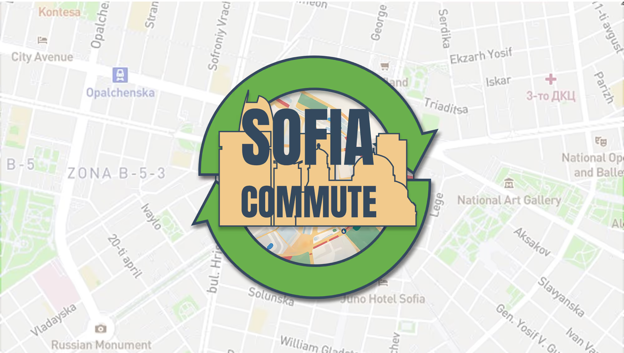
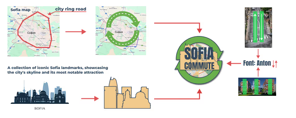
This project, developed by me in 2024, focuses on creating a logo for an eco-friendly mobile app that seamlessly integrates with Sofia's transportation system, promoting sustainable travel. The design thoughtfully combines iconic city landmarks with elements of the road infrastructure, such as the city’s ring road, to symbolize both urban mobility and environmental consciousness. This is reflected in the design process, which explores the silhouettes of key landmarks and the circular shape of the ring road. The logo incorporates a circular form to represent the flow of traffic, while subtle environmental elements emphasize the app's commitment to sustainability. This visual identity effectively ties Sofia’s urban landscape to the app’s mission of guiding users toward eco-friendly travel options, creating impactful and meaningful design.