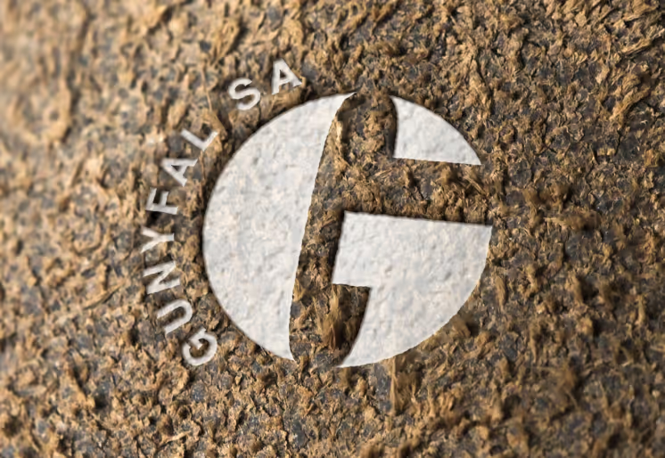
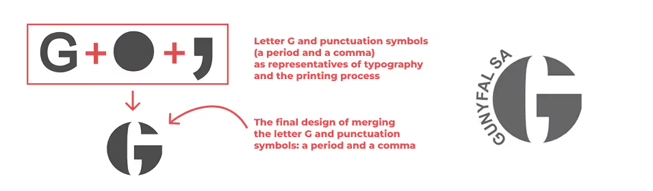
In 2016, I worked on this design case study based on a real project for Gunyfal SA, a company providing comprehensive printing solutions. The project was shaped by thorough research, early concept sketches, and a strategic design approach—all aimed at visually capturing the company’s presence in the print market. The final logo brings together diverse typographic symbols, reflecting Gunyfal SA’s wide range of services and strong market position. As the sketches show, each element was carefully refined to showcase the company’s expertise and the unique value it offers to the industry.