Cover image for UX research case study on Apple’s eCommerce website, showing Apple logo and product visuals including iPhone, iPad, MacBook, Apple Watch, and Air Pods.
In 2024, I created a case study focusing on Apple’s online store, addressing declining customer retention and low conversion rates caused by increased competition, lack of personalization, unclear product information, and weak post-purchase support. As a UX Designer, I led the design process, conducting JTBD research, task analysis, and developing user personas for Android-to-iPhone switchers. Through usability reviews and task analysis, I identified key pain points affecting efficiency, learnability, and user satisfaction. By generating data-driven hypotheses and implementing iterative design improvements, I aimed to enhance the shopping experience, align with user needs, and drive better retention and conversion for Apple’s online store.

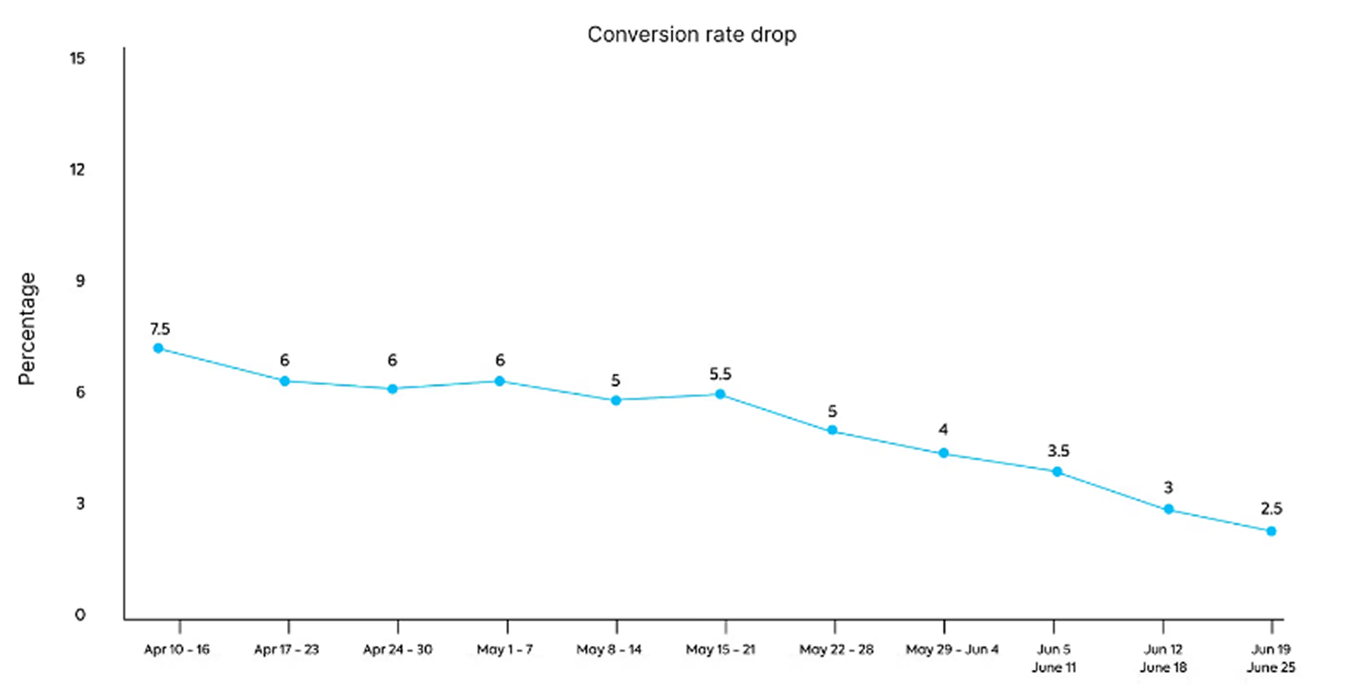
Line graph showing a steady decline in conversion rates on Apple’s online store from April to June 2024, dropping from 7.5% to 2.5%.
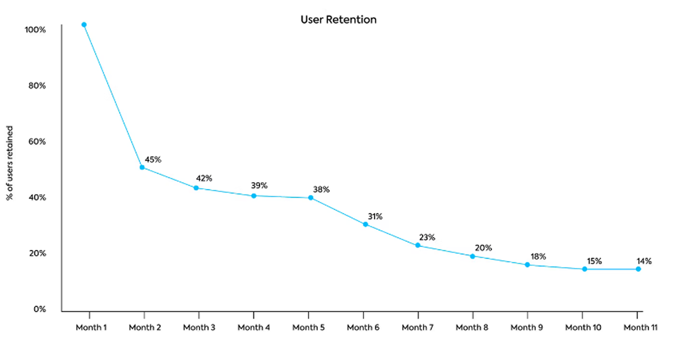
Line graph showing monthly user retention rates on Apple’s online store in 2024, declining from 100% in Month 1 to 14% by Month 11.
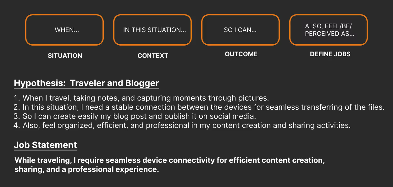
JTBD framework for a traveler and blogger persona, outlining the need for seamless device connectivity while traveling to support content creation, social media publishing, and a professional experience.
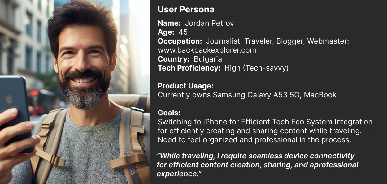
User persona profile of Jordan Petrov, a 45-year-old tech-savvy journalist and travel blogger from Bulgaria, seeking to switch from Android to iPhone for better content creation and ecosystem integration while traveling.
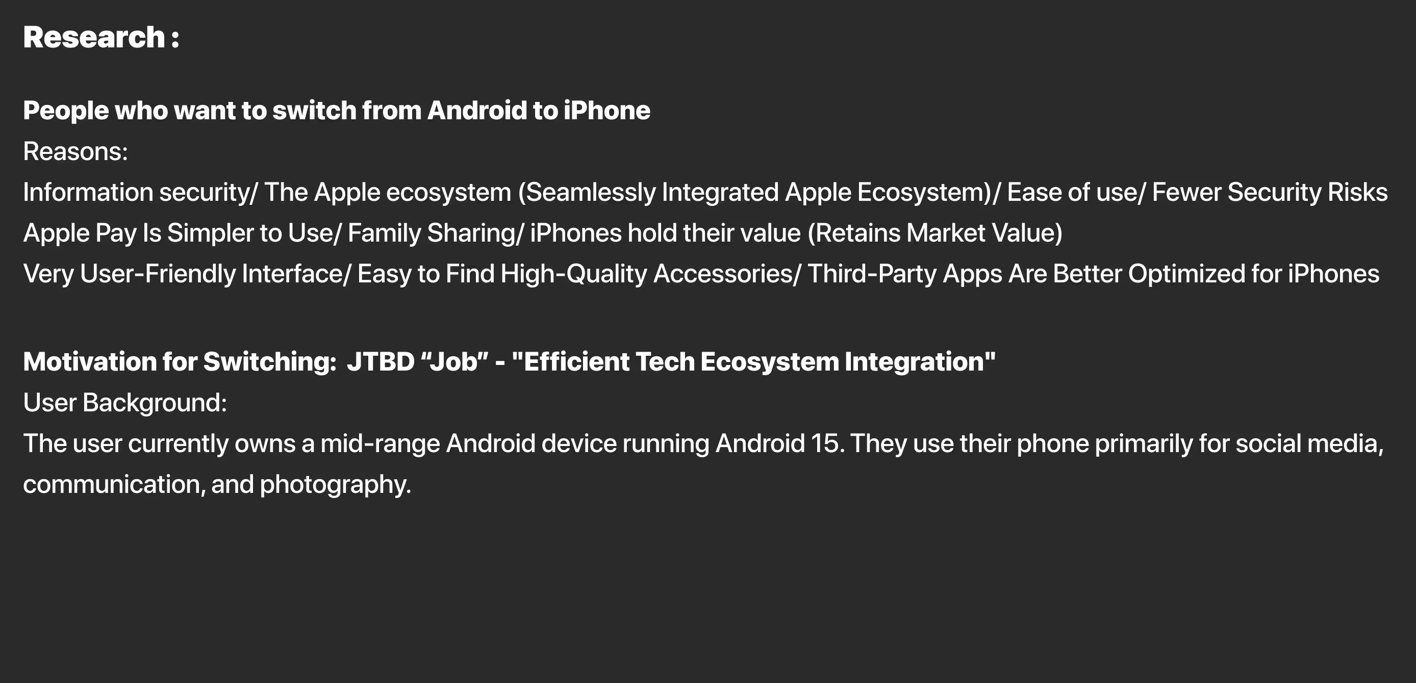
Research summary outlining key reasons users switch from Android to iPhone, including information security, ease of use, Apple ecosystem integration, and better app optimization. Includes user background and Jobs-to-be-Done motivation focused on efficient tech ecosystem integration.
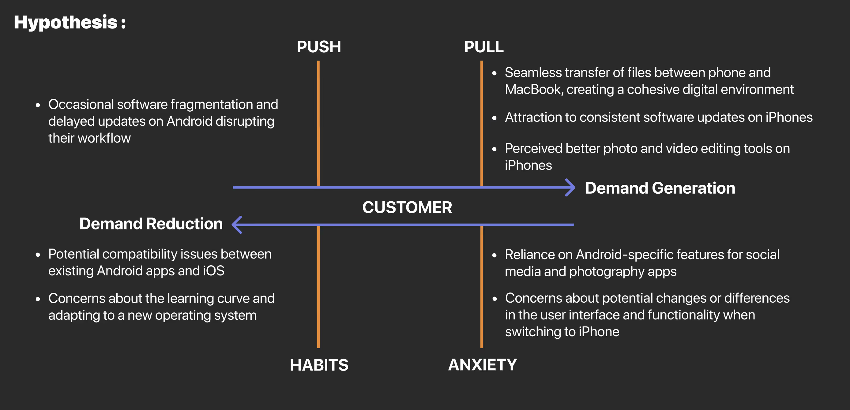
Diagram illustrating a customer hypothesis map for Android-to-iPhone switchers, divided into four quadrants: Push (workflow disruptions on Android), Pull (seamless Apple ecosystem and better tools), Habits (compatibility concerns), and Anxiety (app reliance and interface differences). Represents behavioral forces influencing switching decisions.
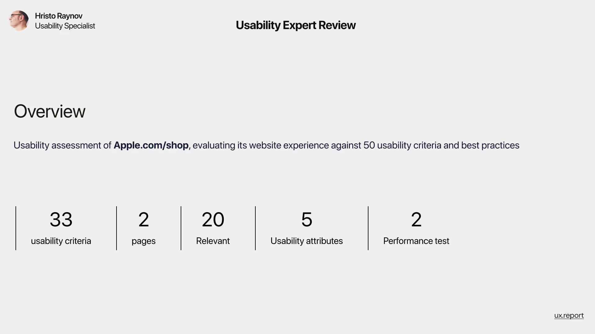
Overview slide of a usability expert review conducted by Hristo Raynov on Apple.com/shop. The assessment covered 33 usability criteria across 2 pages, identifying 20 relevant issues, evaluated against 5 usability attributes and 2 performance test metrics.
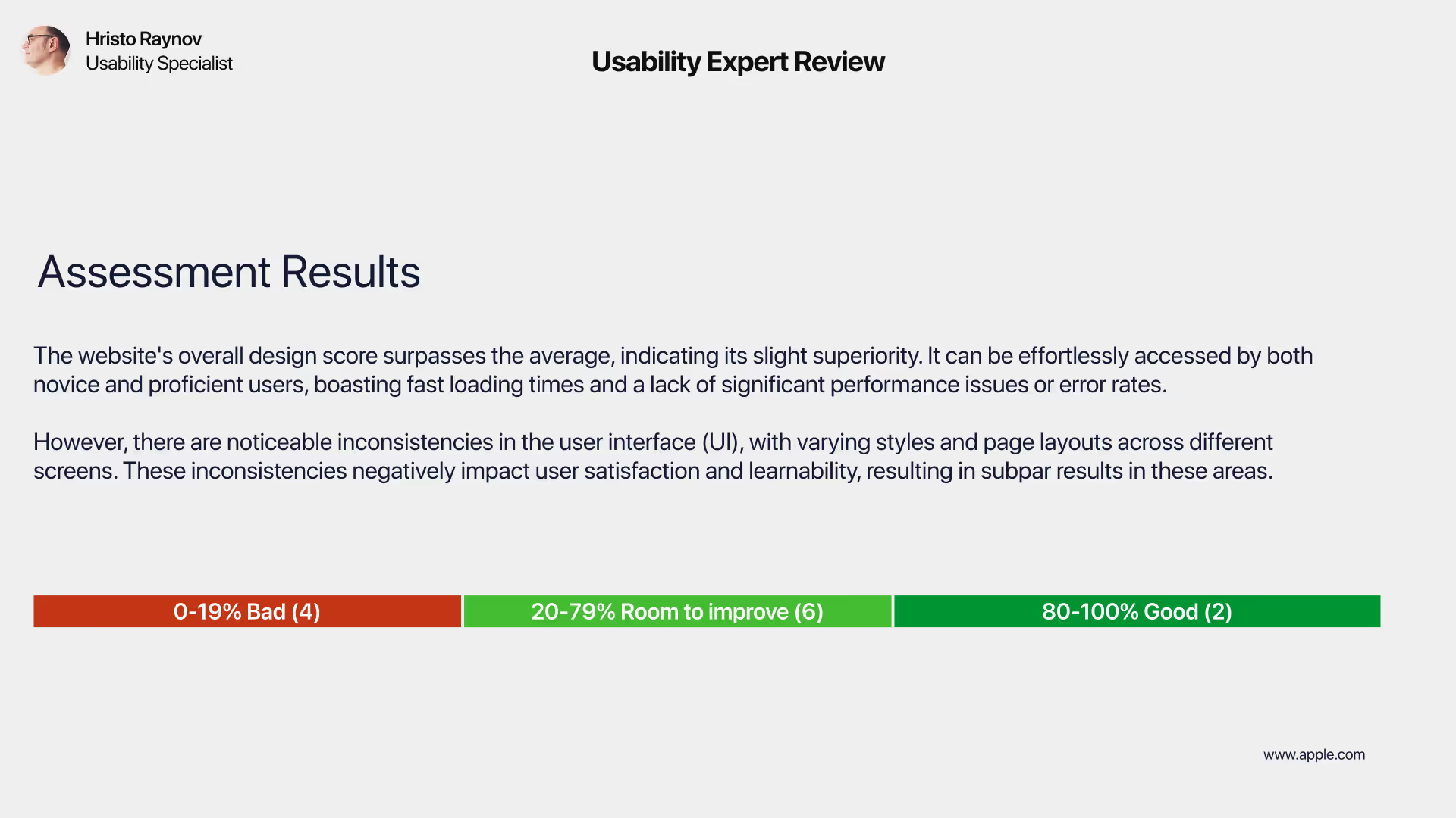
Assessment results slide from a usability expert review of Apple.com/shop. The summary highlights that while the overall design score is above average with good accessibility and fast performance, UI inconsistencies in styles and layout reduce user satisfaction and learnability. A color-coded scale shows 4 issues marked as 'Bad' (0–19%), 6 with 'Room to Improve' (20–79%), and 2 rated as 'Good' (80–100%).
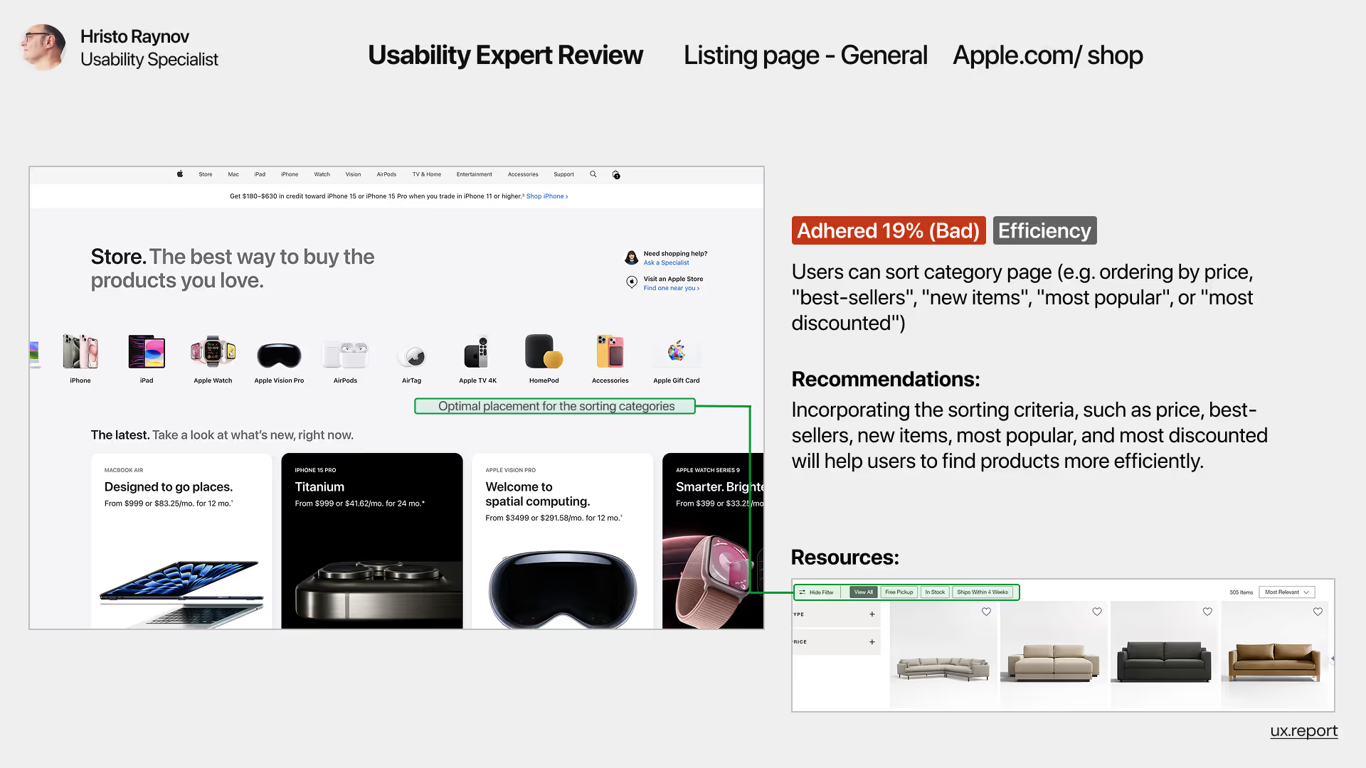
Usability expert review slide analyzing the Apple.com/shop listing page. Highlights an issue with efficiency scoring 19% (Bad) due to the absence of sorting filters like price, popularity, or new items. Recommendations include adding sorting options to help users find products more efficiently. Includes annotated screenshots and resource example showing filter usage.
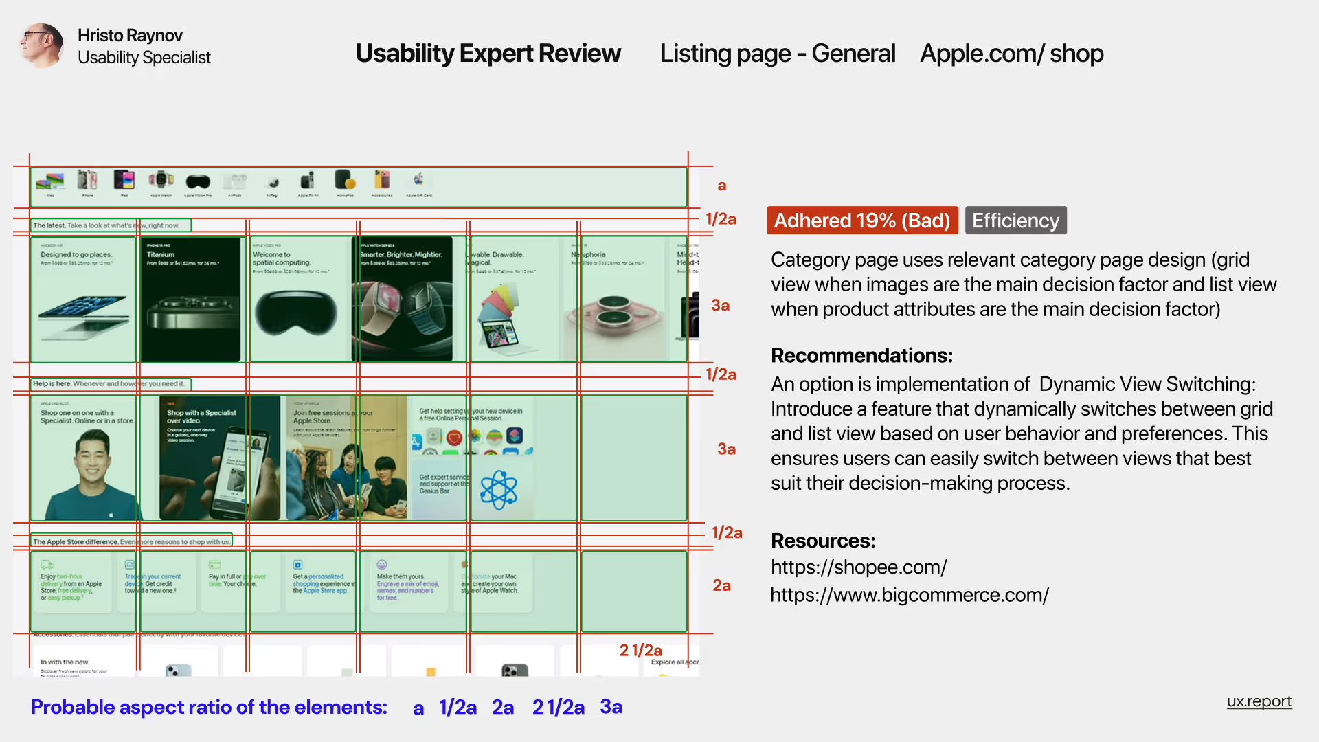
Usability expert review slide evaluating Apple.com/shop listing page layout. Identifies a 19% efficiency score (Bad) due to the lack of dynamic view switching between grid and list formats. Highlights probable aspect ratios of UI elements and recommends implementing dynamic view switching based on user behavior. Includes annotated grid overlay and references to Shop and Big Commerce as examples.
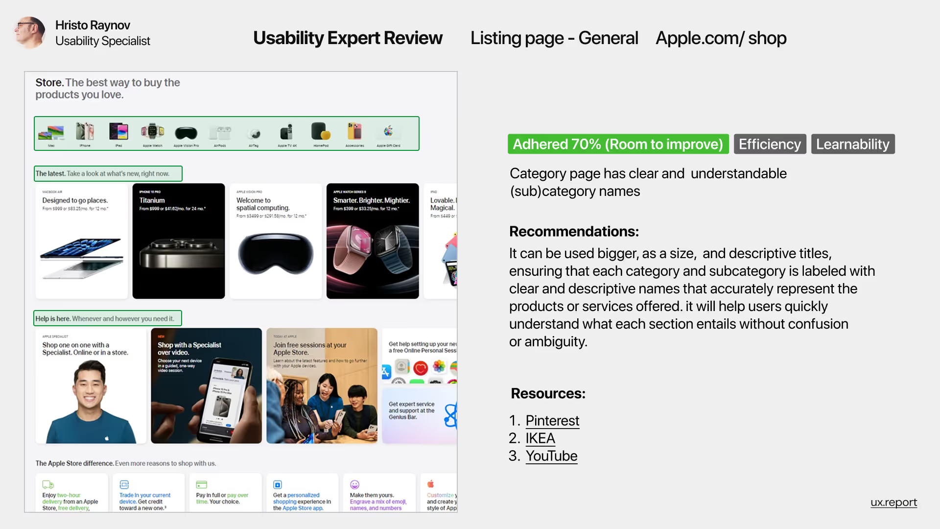
Usability expert review slide assessing Apple.com/shop's category page. Highlights a 70% adherence score (Room to improve) focused on efficiency and learnability. Notes clear and understandable subcategory labels, with recommendations to enlarge and enhance descriptive headings for better content recognition. Includes annotated Apple store screenshot and references to Pinterest, IKEA, and YouTube as best practices.
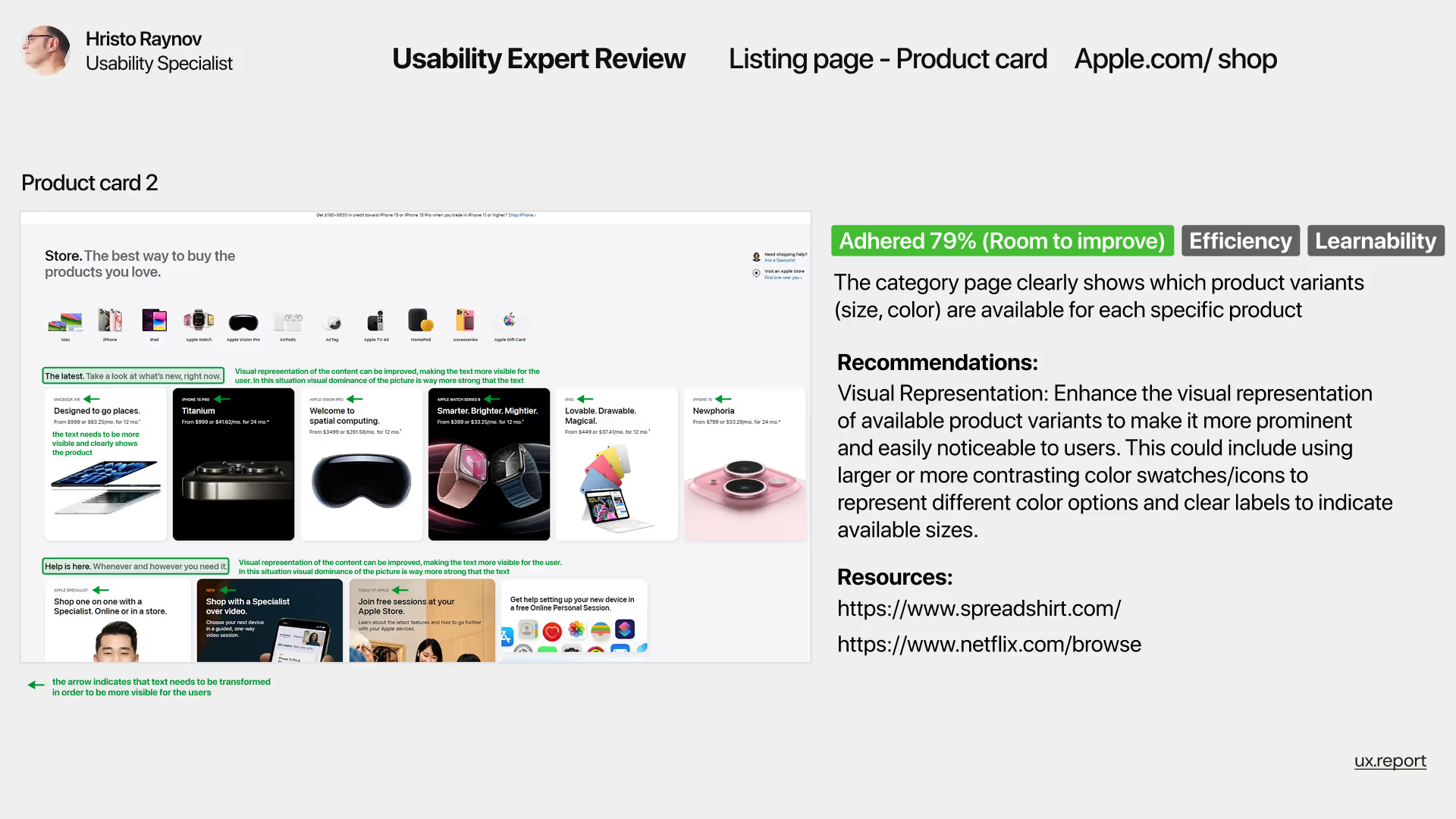
Usability review of Apple.com/shop’s product card layout showing clear product variant options like size and color. The evaluation, rated at 79% (Room to Improve), highlights recommendations for improving visual representation of variants through larger swatches or clearer labels to support efficiency and learnability.
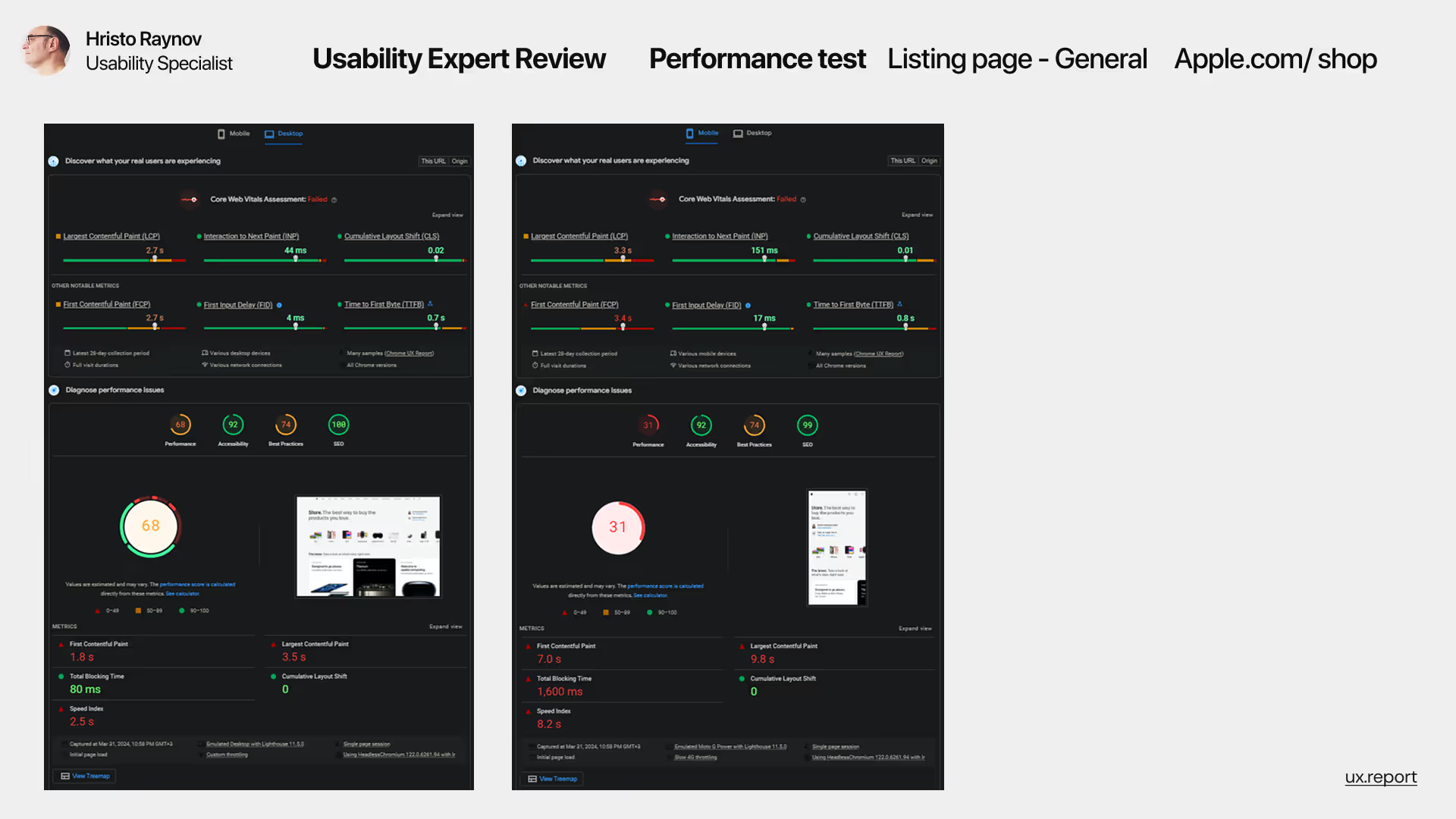
Performance test results from two Apple.com/shop listing pages, highlighting key speed and accessibility metrics. On the left, a performance score of 68 indicates moderate optimization; on the right, a score of 31 reveals major performance issues. These technical shortcomings correlate with task-based usability testing, where users experienced missed ZIP code entries, incomplete AppleCare+ selection, and checkout failures.
Task 1 Results:
60% fully succeeded.
20% succeeded but missed the Zip code.
15% added the iPhone but skipped AppleCare+.
5% didn’t add the iPhone to the cart.
Task 2 Results:
70% checked out successfully.
15% missed the Zip code.10% skipped AppleCare+.
5% didn’t complete checkout.
Task 3 Results:
75% added AppleCare+ successfully.
10% forgot but checked out.
10% had technical issues.5% couldn’t add AppleCare+.
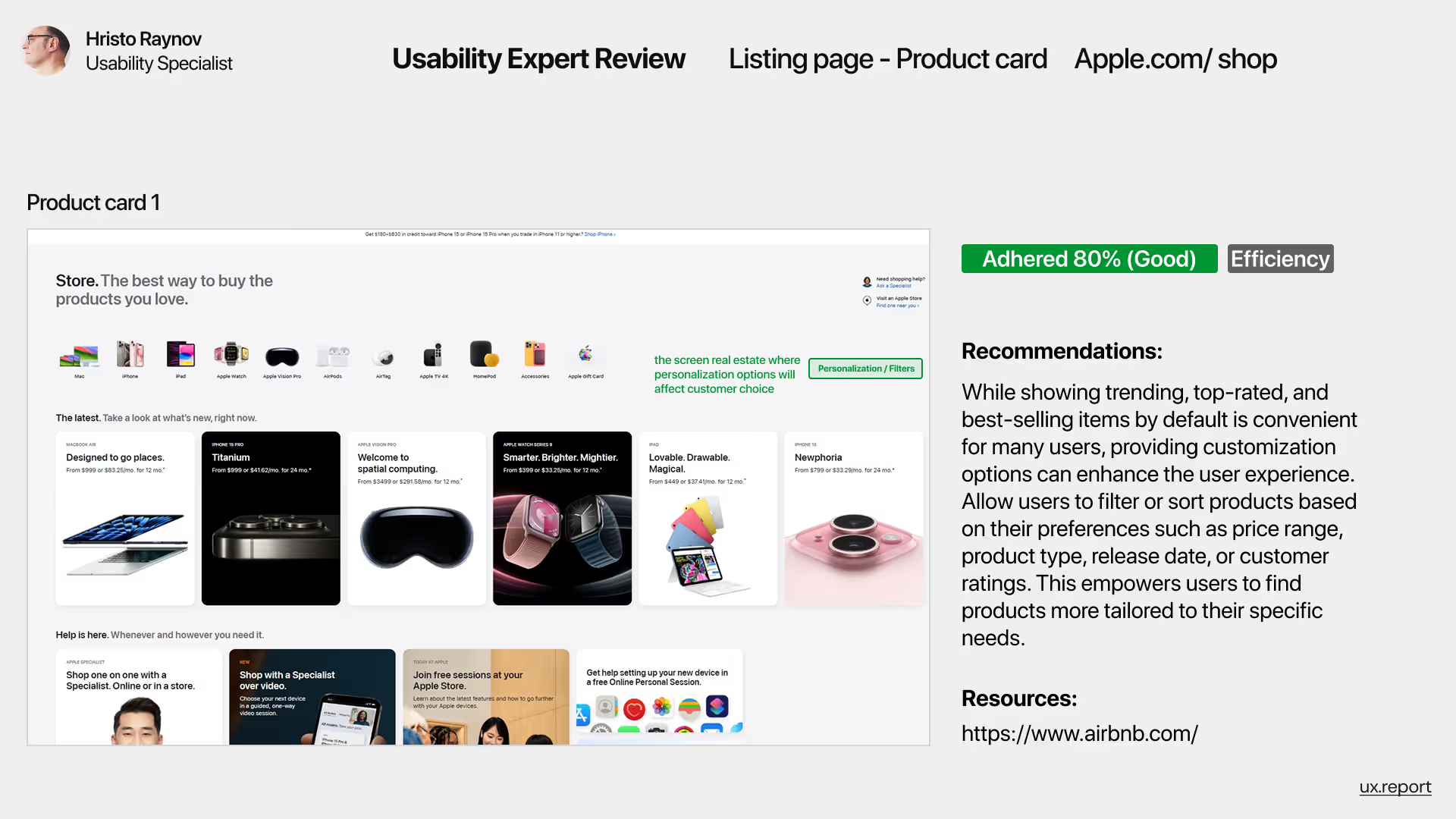
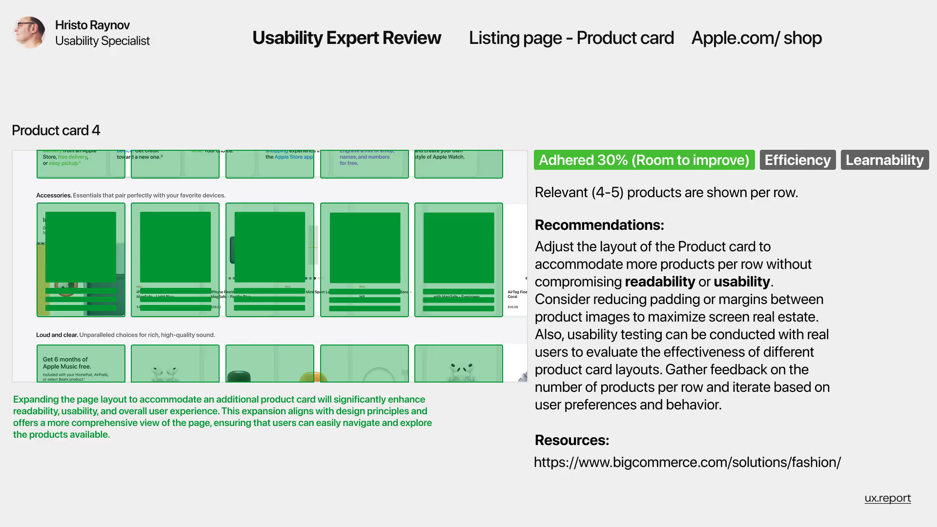
Usability expert review of Apple.com/shop's product card layout, scoring 80% for efficiency. The image highlights how customization and filtering options like price, release date, and customer ratings can enhance user experience. A recommendation suggests empowering users to filter or sort items based on personal preferences, with Airbnb cited as a benchmark example.
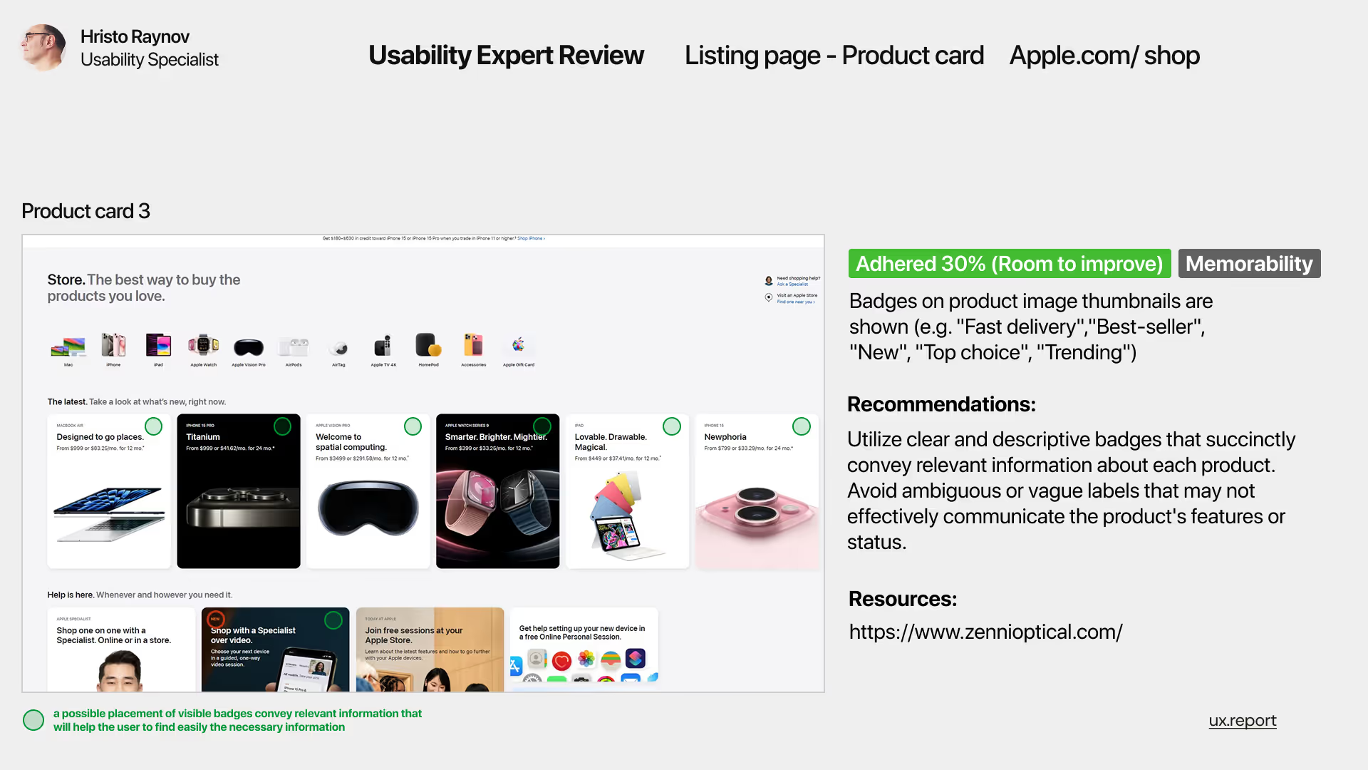
Usability evaluation of product badges in Apple.com/shop’s product card thumbnails. The review shows a 30% adherence score (Room to Improve) in terms of memorability. Recommendations suggest improving clarity and visibility of badges such as “Best-seller” or “Fast delivery” to better convey relevant product information without ambiguity.
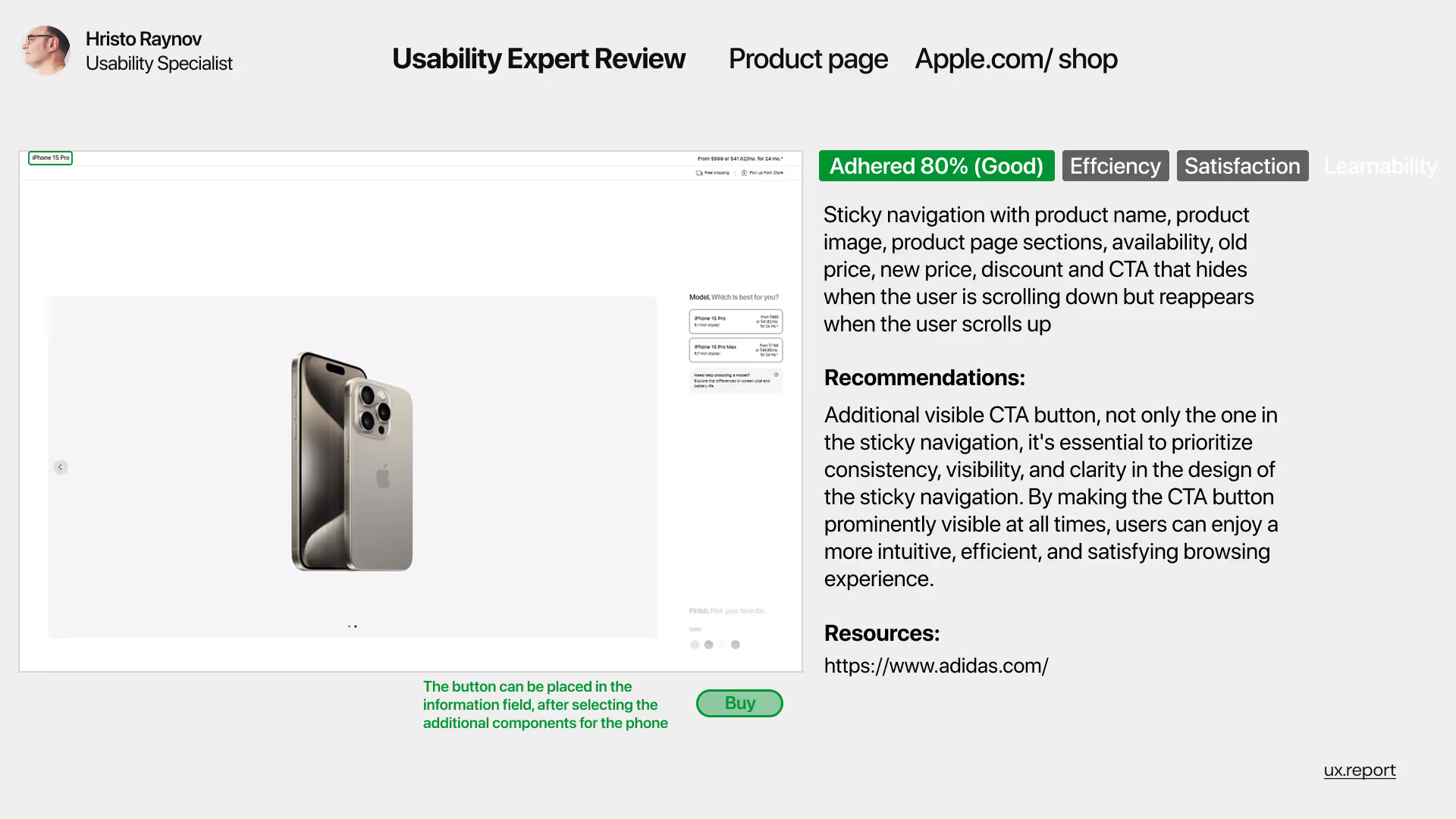
Usability review of Apple.com/shop’s product page highlighting sticky navigation with product name, image, price, and a hidden CTA that reappears when scrolling up. The assessment scored 80% (Good) for efficiency and satisfaction. Recommendations include keeping the CTA button consistently visible to enhance usability, clarity, and user engagement.
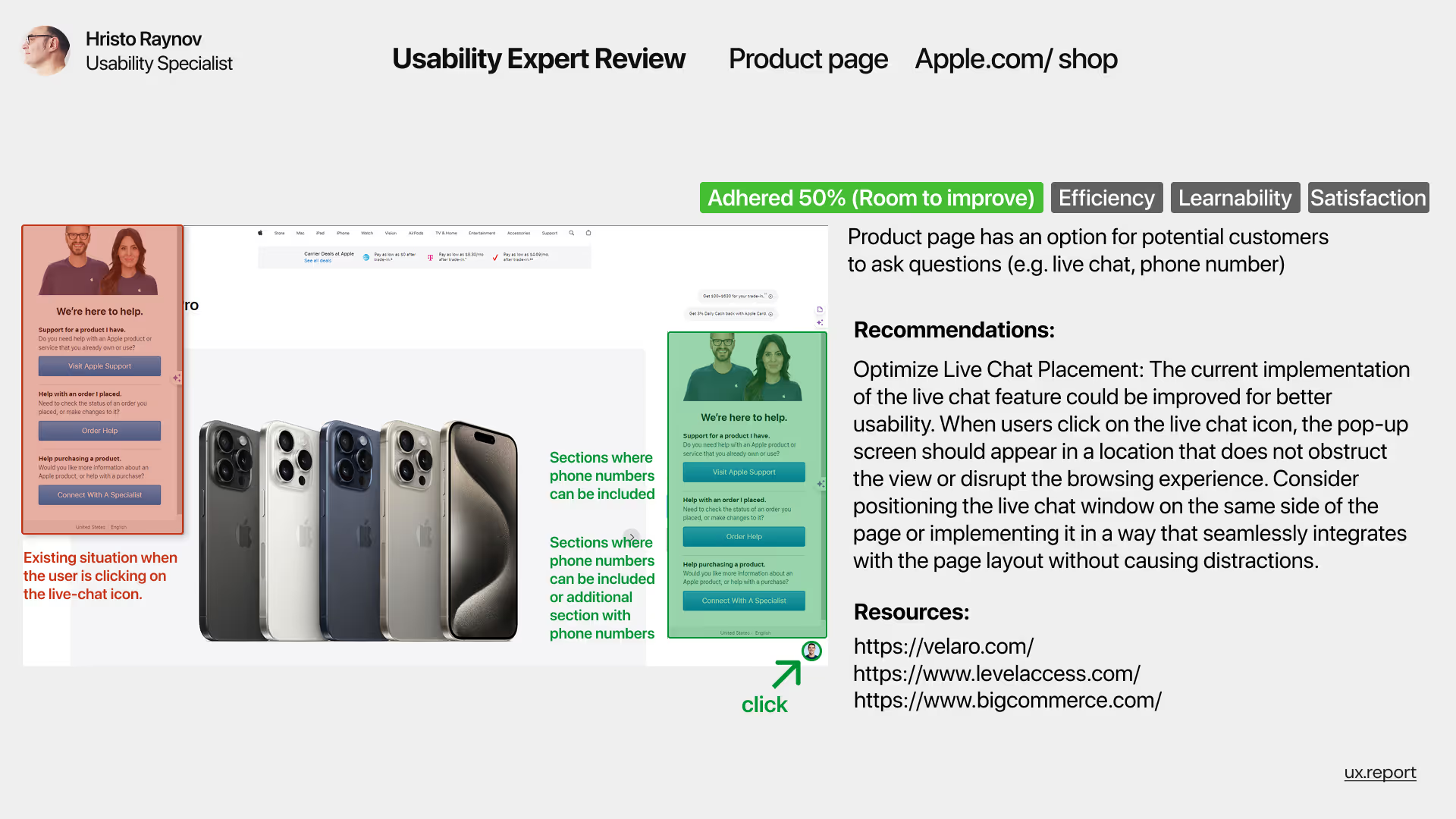
UX review of Apple.com/shop’s product page focusing on the usability of the live chat feature. The image shows issues with current pop-up placement interfering with the browsing experience. Scored 50% (Room to improve) for efficiency, learnability, and satisfaction. Recommendations include repositioning the chat window for better visibility and user flow.
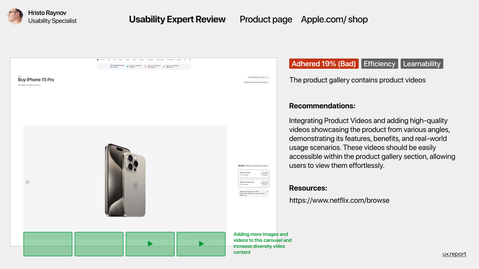
UX expert review of Apple.com/shop’s product page highlighting the lack of effective video integration in the product gallery. The page scored 19% (Bad) in efficiency and learnability. Recommendation includes adding high-quality videos to improve product understanding and user engagement within the product card layout.
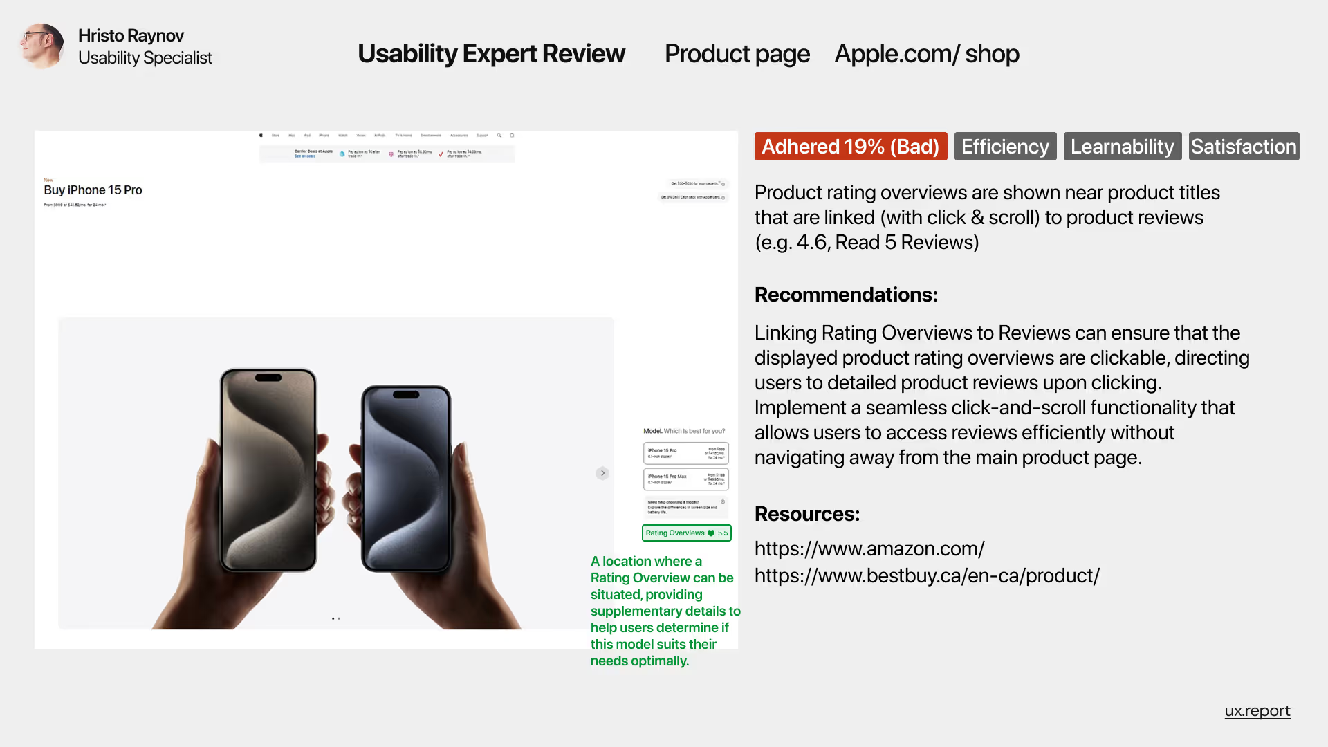
UX evaluation of Apple.com/shop’s product page highlighting a usability issue where product rating overviews are shown but not clearly clickable or intuitive. The page received a 19% (Bad) score in efficiency, learnability, and satisfaction. Recommendations include enabling seamless click-and-scroll from rating summaries to detailed reviews to improve the user experience.